Field To Fork Logo Redesign
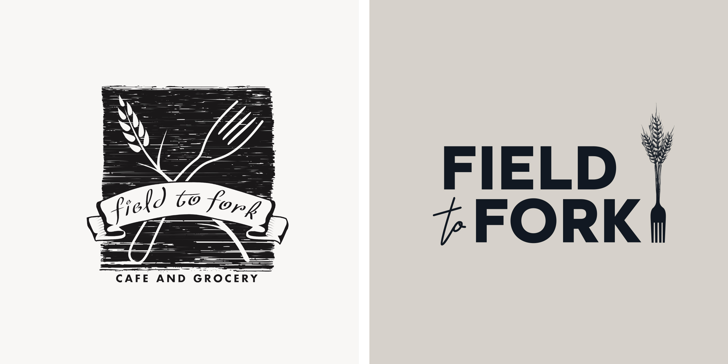
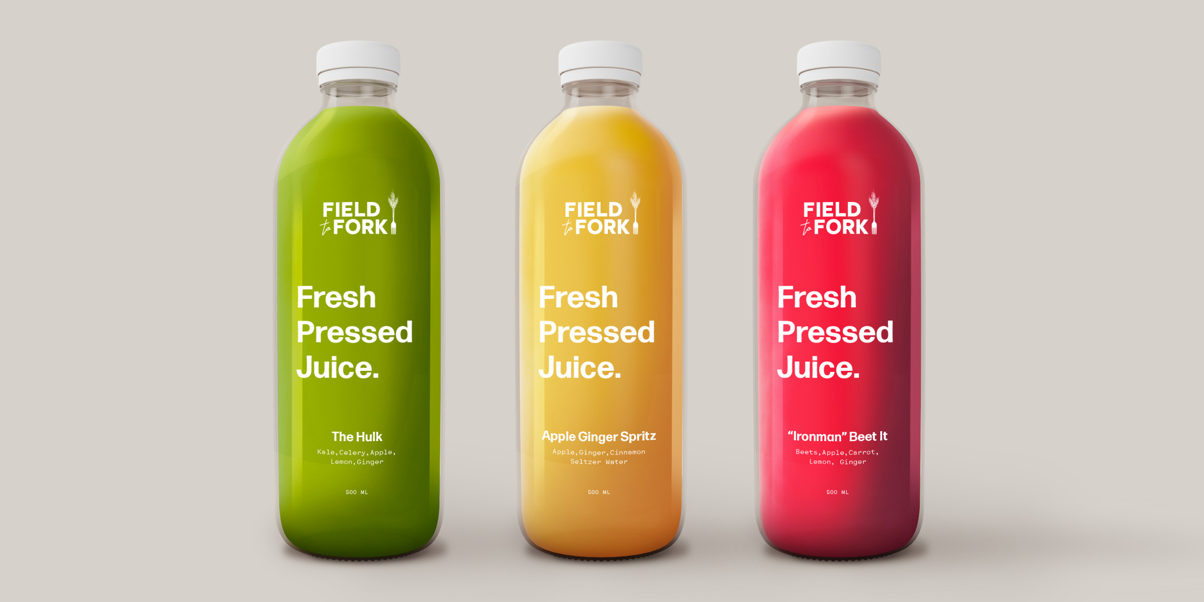
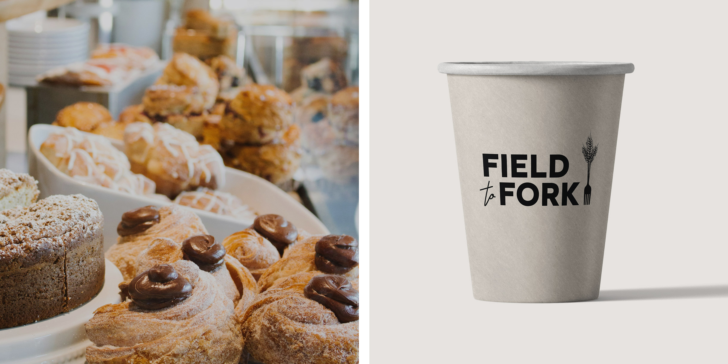
This logo design was crafted for Field To Fork Cafe in Sheboygan, WI. The cafe approached us seeking a refreshed logo, recognizing the importance of modernization while retaining elements emblematic of their identity—specifically, the fork and wheat motifs. Committed to showcasing the bounty of local farmers and producers through inventive culinary offerings, supported by their in-house Bakery, Butcher Shop, Coffee Roastery, and Juice Bar, they sought a logo that reflected their urban, organic, and contemporary ethos. They also decided to drop “cafe & grocery” from the name as they shifted focus solely to the restaurant, launching a new name and business for their grocery store.
Drawing on these principles, I conceptualized designs that seamlessly integrated their core values with a modern aesthetic, ensuring versatility across various platforms. Despite aligning with their brand vision and the universal appeal of the design, our partnership concluded when they chose a different direction. However, we value the opportunity to have contributed to their brand evolution.
